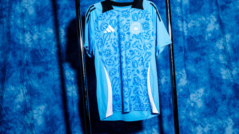
Tepper Sports & Entertainment worked with celebrated design agency Doubleday & Cartwright to bring Charlotte Football Club’s new identity to fruition. One of the formative influences on the name and crest, however, was the local fanbase.
CHARLOTTE—On Wednesday, Major League Soccer’s 30th franchise officially dropped its name, crest and colors.
The development of Charlotte Football Club’s name, black-and-blue hue, and bold crest aesthetic actually began in October 2019—a few months before the city’s MLS team was officially announced.
New York-based design agency Doubleday & Cartwright worked with Tepper Sports & Entertainment on the project, along with a key partner: the fans.
“Our approach is fan-driven,” says Doubleday & Cartwright Director of Strategy Kate Perkins. “In order to get the fans-eye view, we immersed ourselves in Charlotte culture. We visited local soccer teams and bars, talking to as many members of the community as possible. And we consulted with members of the Mint City Collective Supporters group, too.”
The design team spent two weeks on the ground in Charlotte, leaning heavily on the tastes, opinions and values of the soccer community to inform the naming process.
“We tested names to see what would resonate with the local fanbase,” says Doubleday & Cartwright Executive Creative Director Peter Christofferson. “We looked into using nicknames for the town during the process, but they didn’t land quite as well as Charlotte Football Club.”
In the weeks leading up to the name and crest reveal, a shortlist of names was whittled down and teased via social media posts. The final result, however, had already been informed by fan consultations.
“By far, the number one, the favorite name, has been Charlotte Football Club,” says club president Tom Glick, referencing the consultation process. “Amongst the entire sample, as well as especially amongst soccer fans within that group.”
A key driver behind the name was the sense of pride that many Charlotteans feel in their home—whether they are from the city, or further afield.
“We found that people are proud to wear the name Charlotte, even if they are not originally from the area,” says Perkins. “Some upcoming cities feel transient, but Charlotte’s transplants want to stay and feel at home. So we wanted to give the fans a sense of belonging and ownership in the team name.”
While the design of the crest went through several iterations, a consensus was easily reached on the team colors.
“There were several different design drivers, but the color format was fairly clear,” says Doubleday & Cartwright Senior Creative Project Manager Olivia Cohen. ”Blue is a color that is ownable to Charlotte and the Carolinas. We wanted to maintain the color scheme that holds so much value in the region.”
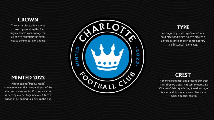
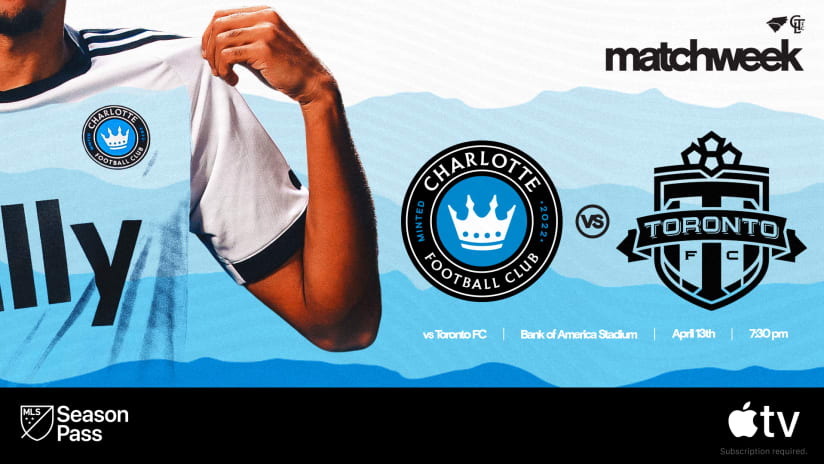
The crest motif is inspired by Charlotte’s origins as the location of the first-ever US Mint, and its modern status as a global financial hub; the “Minted” proclamation ties together the old and the new.
“Charlotte is a banking town, and was a minting town in its founding, so we sought to strike the balance between modern and historic,” says Perkins. “We love the connection between the city’s history and its modern transplant culture.”
The centerpiece of the crest, meanwhile, is a ubiquitous image in a city named for a queen: the crown. Its four spires represent the four original wards of the city.
The typeface, also prominently displayed in the secondary marks, has a similarly regal feel. “It’s a standout feature of the brand,” says Christofferson. “This typeface felt unique within the league, as it doesn’t exist with any other teams. It feels both historical and modern, and it resonated with Mr. Tepper and the rest of the leadership team.”
The design process was fan-driven, but team owner David Tepper played a key role in the evolution of Charlotte FC’s look and feel from the outset.
“We started the entire process by showing Mr. Tepper other marks in the league,” says Perkins. “He consistently picked out graphic-based marks, which were bold and clean.
“That’s a matter of taste, and it’s a good one.”

